Figma
Three weeks
Design Audit, Synthesis, Prototyping, Journey Mapping, User Personas, Site Mapping, User Interviewing
(Solo) Product Designer and Researcher

SCCDineOut is an app that provides access to food facility inspection results in the Santa Clara County and is recognized as the official app for the county's Department of Environmental Health.
With this app, you can view summaries of health violations, inspector observations, compliance scores, and so much more for any recognized food facility.
To be candid, the outdated and inconsistent design of SCCDineOut hinders user navigation and deters them from utilizing the app.
As part of a design challenge for Rivian Automotive, I applied methods such as user research and a design audit to uncover any pain points and problems with the app. I then leveraged these insights to redesign the SCCDineOut Experience.
User research, product design, user testing/validation

With any redesign, I like to start off by familiarizing myself with the product I’m designing for. This helps me gain a sense of the breadth, so to start, I created a site map to understand and organize the information and page architecture of the app. Doing this helped me visualize the entire user flow more efficiently, and I used this as a reference point when exploring the current user journey.

In addition to site mapping SCCDineOut, I audited the current experience and conducted a heuristic markup to take note of my personal frustrations and delights, and even though I established my own pain points, I withheld these until I was able to meet with users to validate them. So for example, some of the concerns I had with the current experience revolved around functionality and overall structure.

The next step in my process was to discover user frustrations apart from my own. Fortunately, I was able to conduct 3 open ended interviews with participants from various backgrounds to gather insights, and as you can see, I had quite a few so I organized my findings onto a whiteboard according to general themes and opportunities.

I synthesized my findings into 4 main pain points that were shared between all 3 participants. Apart from an out of date visual design, the first major pain point users had was a lack of direction. For example, upon entering the app, my participants weren’t too sure where the starting point was because there was a blank screen, where it wasn’t until they tapped search, they uncovered the information and functionality they needed. The other pain points include inconspicuous features and unnecessary pages, where users either had a hard time discovering essential information or they found other parts of the current experience, like the information and closures pages, unnecessary.
Out of date visual design
Lack of direction
Hard-to-find features and pages
Superfluous steps, actions, and pages

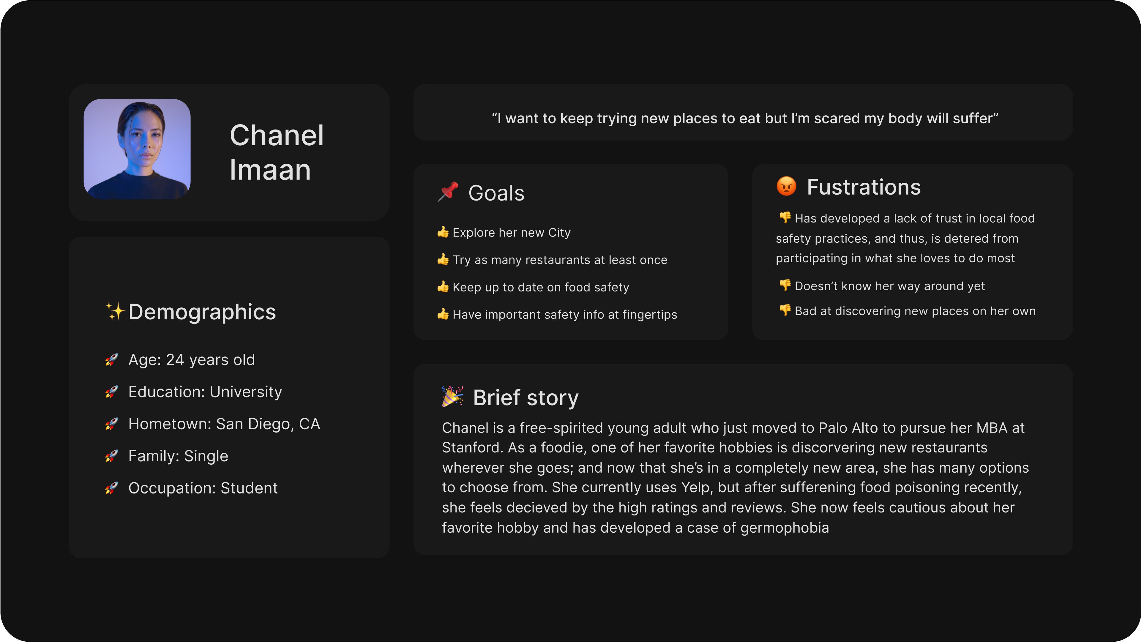
I created a persona based on my user insights to help me drive decision making and keep my redesign focused on directly addressing user pain points.
I then mapped out the users’ emotional journey with the current experience to help me visualize which stages they were experiencing the most frustrations with.
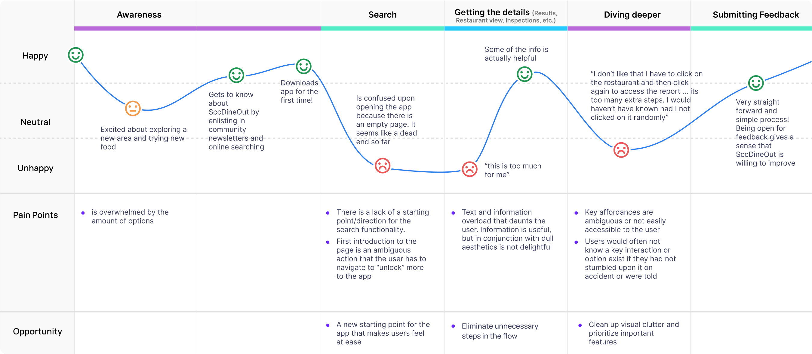
The stages that needed more attention were the searching process, obtaining information (such as restaurant and inspection details), and lastly, uncovering features that made the app more personal. Since I had everything laid out in one place, I took this time to identify a few opportunities for these stages such as a new starting point for the app and eliminating superfluous actions.
Doing everything up to this point, I felt I had substantial insights to be able to craft my problem statement, asking:
Next, I began ideation by jotting down a few features that aimed to tackle user needs, and I organized these features into themes. Some of these features included having a map view so users can visualize nearby restaurants and search more efficiently, and a dashboard and discovery page to that acts as a starting point and offers users a sense of direction.

I then took the time to distinguish which features would be nice to have but would require more work, and which features are more more essential to the redesign.

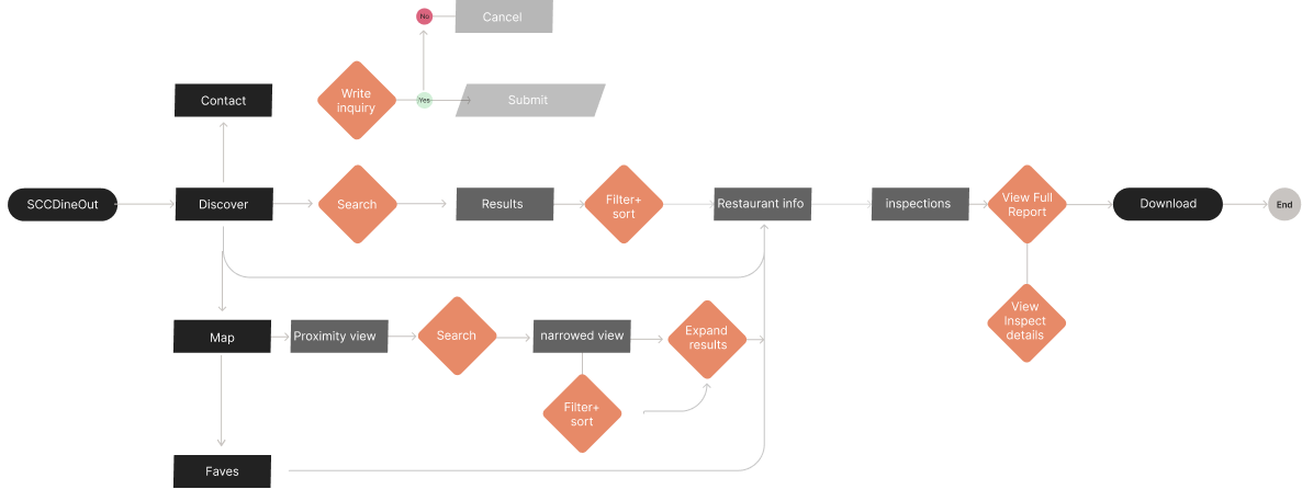
The following flow was created to help articulate how a user would navigate the app and reach their goals in the new design. The primary user flow is the process of discovery, searching, and obtaining useful information.
I began ideation by focusing on three flows to sketch, which were map and search, discovery, and restaurant information. This is where I illustrated how the aforementioned features would look. These sketches acted as a blueprint that would allow me to bring my concepts to life in the form of mid-fidelity wireframes.
Map and Search
Discovery
Restaurant information


As shown below, the new flow for SCCDineOut is intended to flow naturally, eliminating superfluous actions and steps. With these mid-fidelity screens I was able to begin user testing.

My next step was to engage with my users to gather feedback on my concepts and identify areas of improvement. I decided to have them test with my mid-fi wireframes to get a sense of how they interact with my designs in the early stages to uncover unexpected needs and expectations.
I had my users perform a series of tasks that include search and filtering, getting restaurant details, etc., and I organized my findings on a diagram according to frustrations and misunderstandings, delights, and new ideas formed.
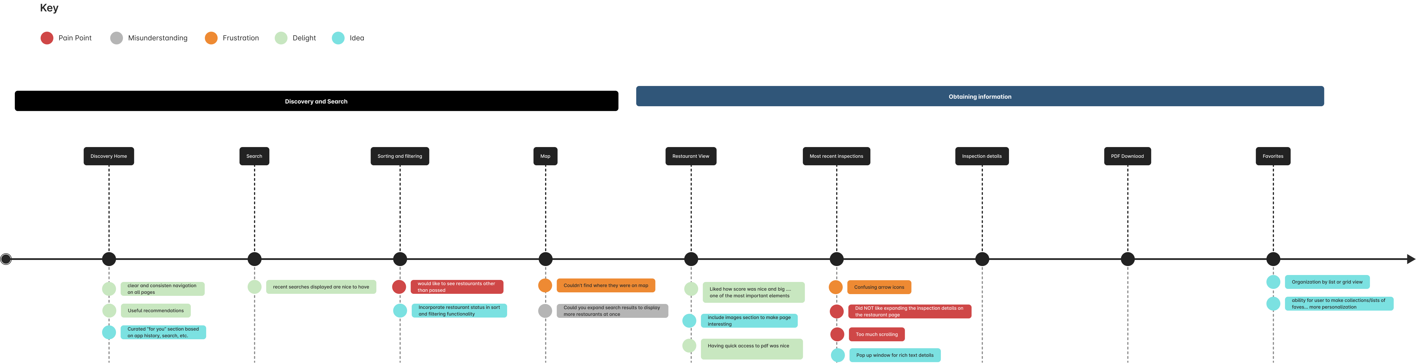
Expand inspection details to get inspector comments
Sort restaurant results 5+ miles away in alphabetical order
Download full inspection report PDF
Users wanted to see restaurants that didn’t pass (so they wanted to see variation in scores) and have access to more filtering options, there was concern with how the search on the discover page would parallel with the map search, and there were other frustrations like too much scrolling and confusing buttons etc.
Based on various feedback from users and mentors, I continually iterated my final designs over the last leg of the project. These are the results:

Having the availability of featured and nearby restaurants makes discovery easy and offers a sense of direction for users. With user feedback in mind, there is variety in restaurants displayed to include failed and conditionally passed inspections. There is also an added convenience of being able to use the search bar for quick simple search so that you don’t have to switch pages to the map view.
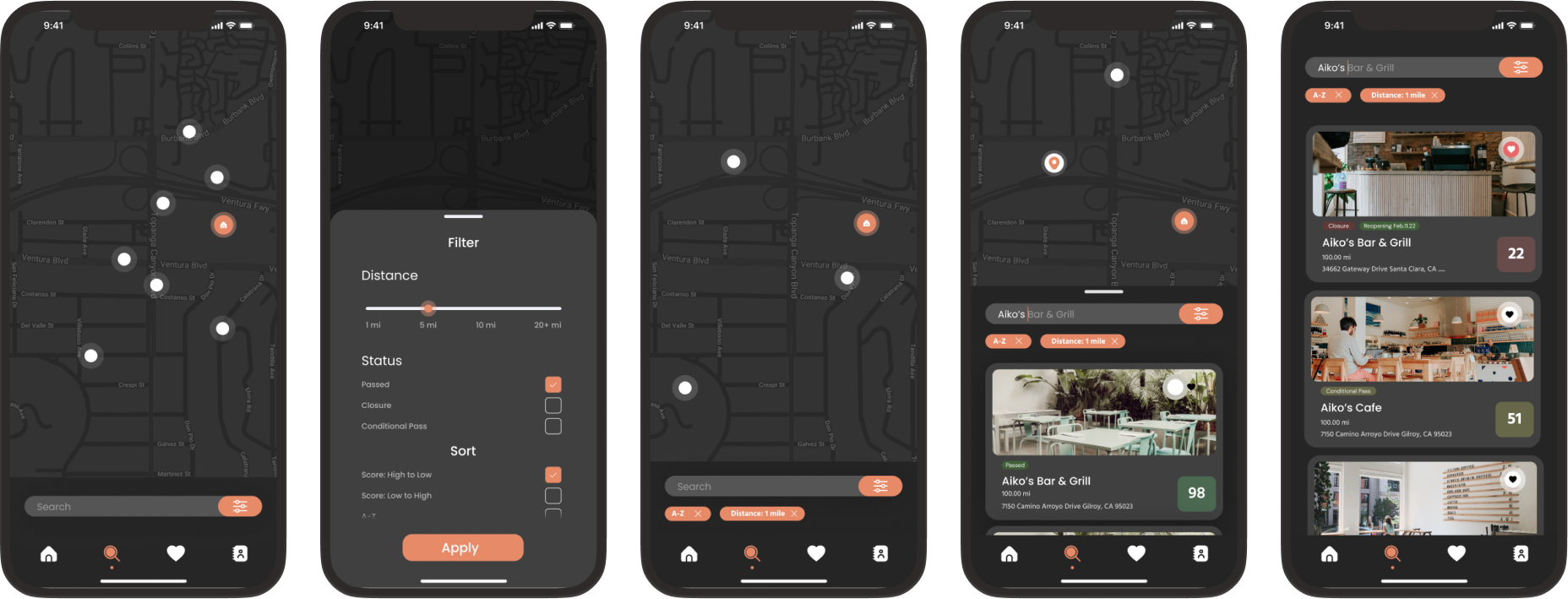
I decided to use a map view so users would be able to visualize restaurants more efficiently and offer an added level of discovery. Responding to user feedback, I incorporated restaurant status and more search and filtering options to enable more control of search based on individual need and organization. I also moved the search bar to the bottom of the page to allow for reachability and accessibility.

Finally, this is what the restaurant view looks like. To address user pain points, i simplified this page by eliminating unnecessary actions and scrolling by allowing the users to view and download the full inspection report right off the bat, and if they would like to see more details, they would be able to pull up a pop up and view the details that way instead of scrolling.
After working on this project for three weeks, I presented this app redesign to the Rivian design team, where I was able to move forward in recruitment.
This was a very stimulating challenge that helped me showcase my creative thought process, and there were many explorations I would have liked to get to if I had more time. At first, this project was challenging because there are so many directions I could have taken and it was very open ended, but connecting with users really helped keep me grounded and allowed me to be driven by insights.

